Directing In My "Anti-Style": Part 1
Using a documentary project to challenge my creative default settings.
In mid 2023, Directors Miao Wang and Hao Wu approached me about creating animations for the court room scenes of their documentary film “Admissions Granted.”
The log line: “In a landmark Supreme Court case pitting Asian American plaintiffs against Harvard University, activists on both sides wrestle with hard truths about race, equality, and Asian Americans' precarious status in America, as the fate of affirmative action hangs in the balance.”
Before we dive deeper into the design process, give this project case study a watch to see what we’ll be breaking down.
Finding The Concept
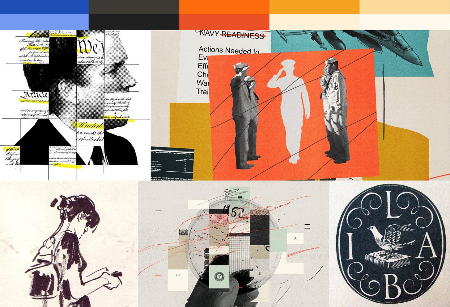
In our first discussions, it became clear that news clips and editorial excerpts would play a huge role in defining the narrative of this film. In my mind, this screamed “collage.” However, the directors also liked my work or “Aka: Mr. Chow,” which was line-based and illustrative.
So as with every project, the task became about synthesizing client references, the films’ concepts, and my own creative instincts into a unique design direction. I pitched a concept that I would later refer to as the “Paper Trail.”
As I said in the initial pitch deck: “This style will borrow elements from political editorial illustration, photography, and collage, while also mixing in calligraphy-like lettering and hand drawn typography.” These design principles would change later on.
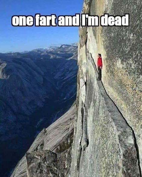
When I pitched this style, I realized I was setting myself up for a challenge. In rock climbing, there’s a handy bit of jargon known as your “anti-style.” A climber’s anti-style is something that is innately challenging for them, both physically and mentally.
Collaged design is my anti-style. It presents ambiguity in the planning process. You have to figure out which images go where, legal sign off on those images, and make sure resolutions are consistent. And it’s not entirely drawing based. But…I am.
Regardless of how challenging collage felt from a production standpoint, it was the right call for this project. Anything else would have felt empty and not related to the subject matter. So I did what a lot of animators do and thought “hey, I’ll figure it out.”
Bringing The Concept To Life
Once given client approval, I had to outline the specifics within my collage “anti-style.” Luckily I was provided a suite of photos and documents that I could use to sketch off of. Well GUESS WHAT, those image options were constantly changing. This was no one’s fault. Documentary work is an iterative process. But still, something that already felt difficult was now even more precarious.
So now how do I sketch with images in mind that might not be usable later on?
My solution was:
Utter Chaos.
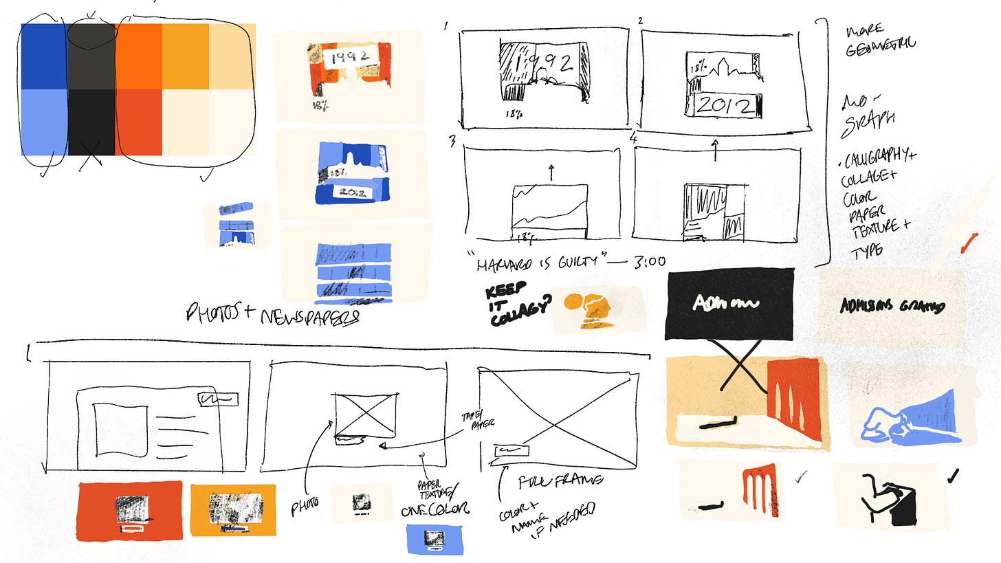
I threw relentless free association at this problem. I would make outlines and rough sequences based off of my storyboards (which were no longer applicable because the edit had changed). I drew with an ideal type of image in mind and hoped we would find it later on.
Gradually, through much repetitive scrawling and sketching, I realized that this collage process was not going to work with this much uncertainty. So I adjusted the rules of my concept:
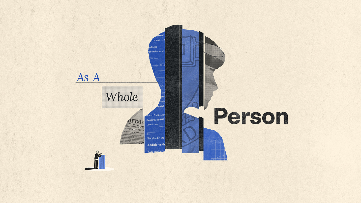
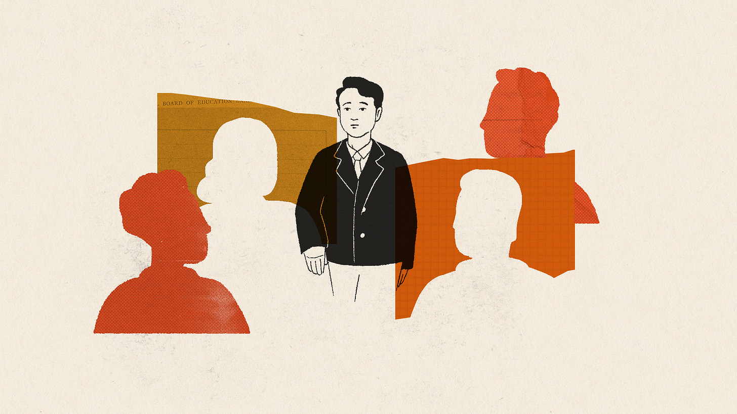
Cutouts: We compose scenes using simple, colorful, rough edged shapes and silhouettes. This was we can play with collage in a more illustrative way, unencumbered by logistical photography issues.
Textures: We alternate between 5-6 textures (paper, cement, ink smudges) and overlay them on top of cutouts. This gives us the illusion of collage photography, without the headache.
Ink Drawings: We use ink drawings for characters and objects that need to be recognizable and emotional.
Light vs. Dark: We use light textured backgrounds for state courtroom scenes and dark textured backgrounds for supreme court scenes and animations on Amicus briefs.
Chaotic Process, Organized Results
The process for my conquering my “anti-style” ended up being perseverance, iteration, and re-framing my approach. The visual result was a flexible design style, that maintained the spirit of collage without the pain of using full photography. The styleframe below was where all the principles came together for me:
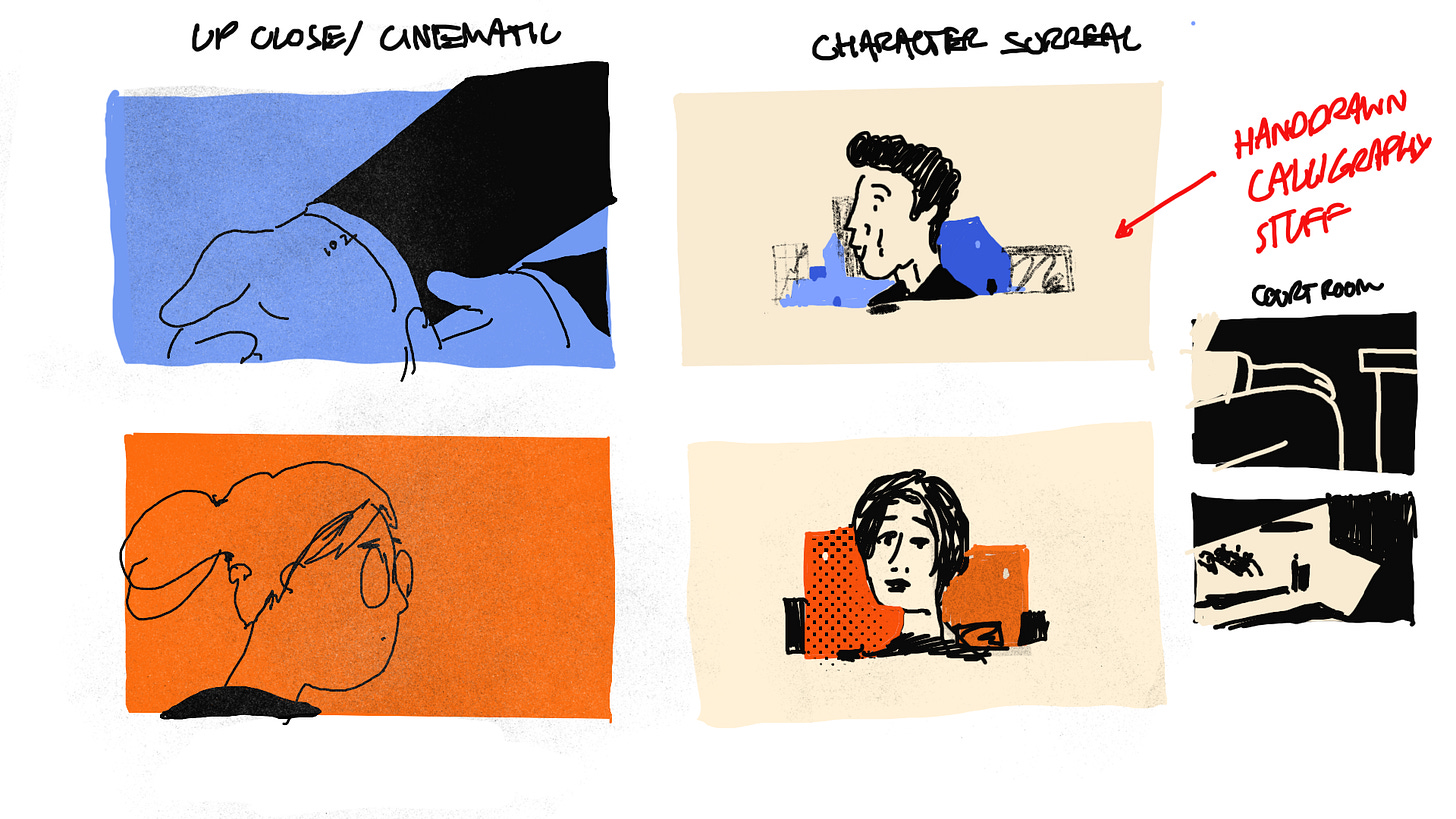
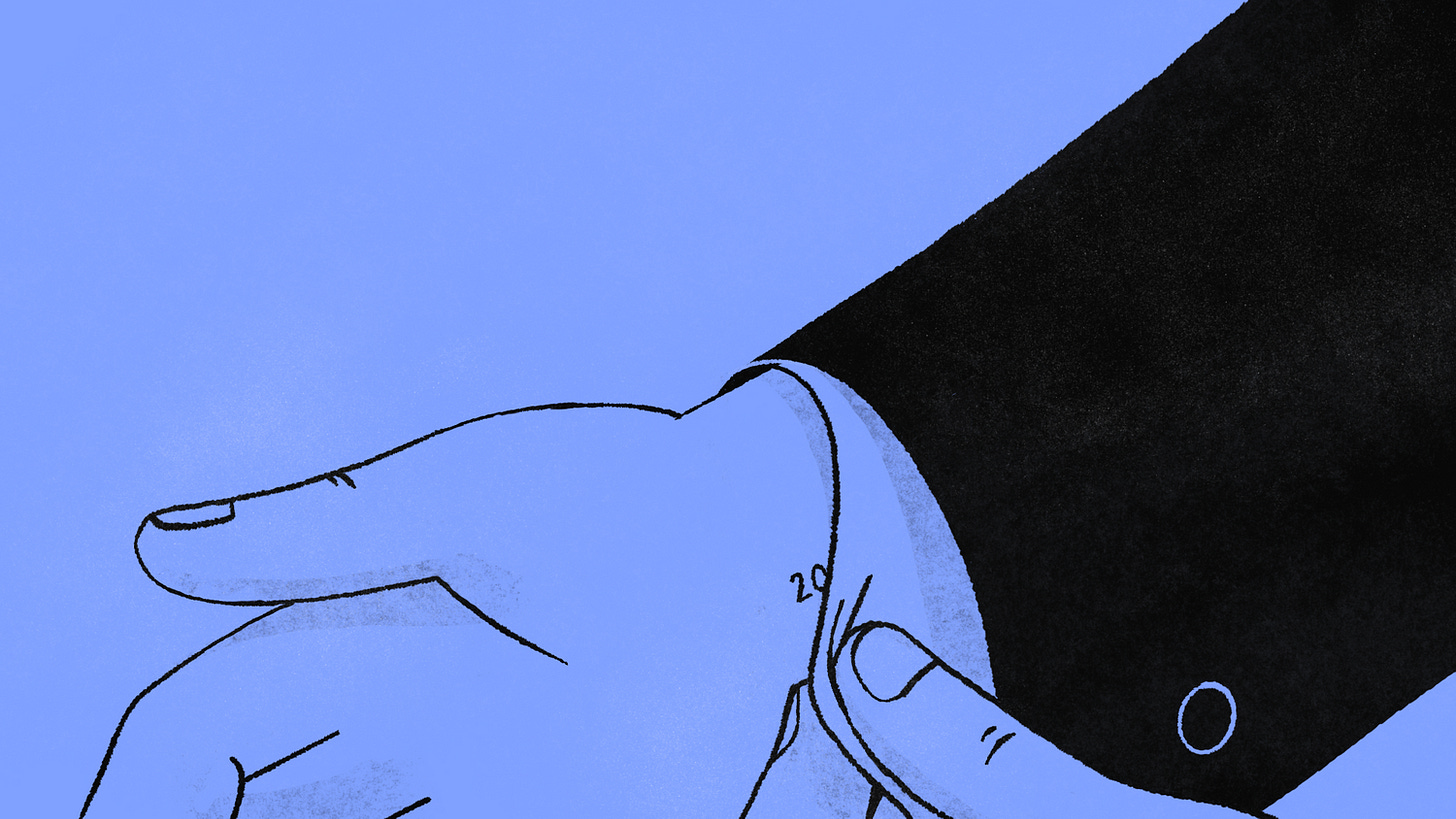
Below are a few explorations that I loved, but didn’t make the cut:
Thanks for reading! Stay tuned for an animation focused breakdown of this project. But for now, embrace the chaos and conquer your anti-style.
And now for your obligatory cat photo:




This is a great breakdown! It made me feel better about some of my collage projects that have gone completely off the rails. Thanks!