Motion Graphics Review: Heated Rivalry
How the graphics and live action can tell two different stories.

The gay hockey show “Heated Rivalry,” hit the internet and our household like a slap shot from a caked up Russian Hockey player hitting the net. My wife Emily and I blazed through it with our phones down and our full focused attention. Besides the amazing performances and the beautiful depictions of forbidden yearning, one thing really stood out to me in a way that broke the illusion: The motion graphics.
The quick title sequence feels tonally mismatched to the tender and carefully told story of the show, making the graphics and the live action feel at odds with one another. Moreover, the frequent location cards and time stamps become more distracting than helpful (almost funny), and I think many fans of the show would agree with me there.
So today I’m going to investigate what makes the Heated Rivalry motion graphics stand out, explore some potential solutions, and touch on how this graphics treatment might indicate how streamers view their audience.
*Spoilers for Heated Rivalry Season One*
The Graphics Mismatch
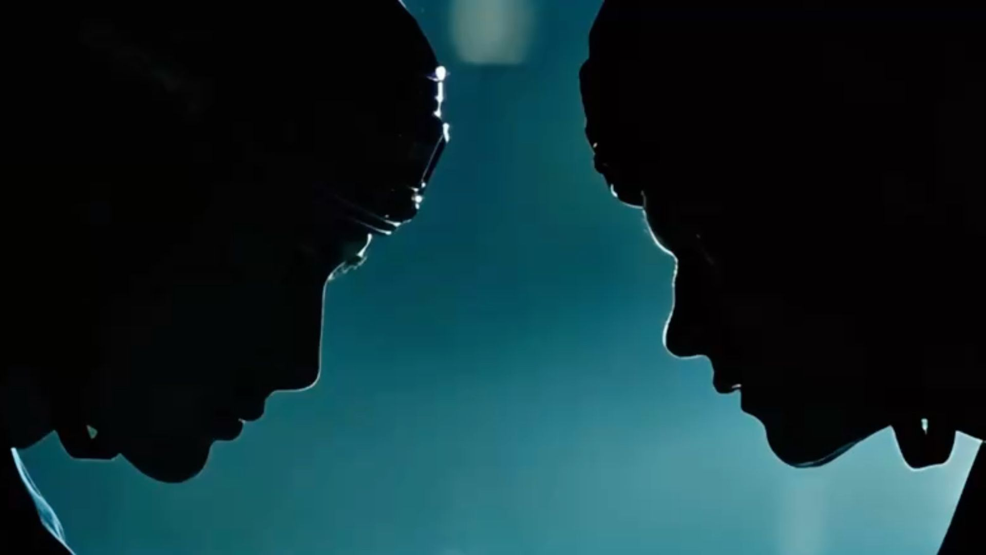
The Titles
When the title appears in the show, it fades in over the live action footage and the main word mark scales in. The camera then pushes in between the top and bottom words, the letters space out to the edge of frame, and we zoom in on the “Created by Jacob Tierney” credit.
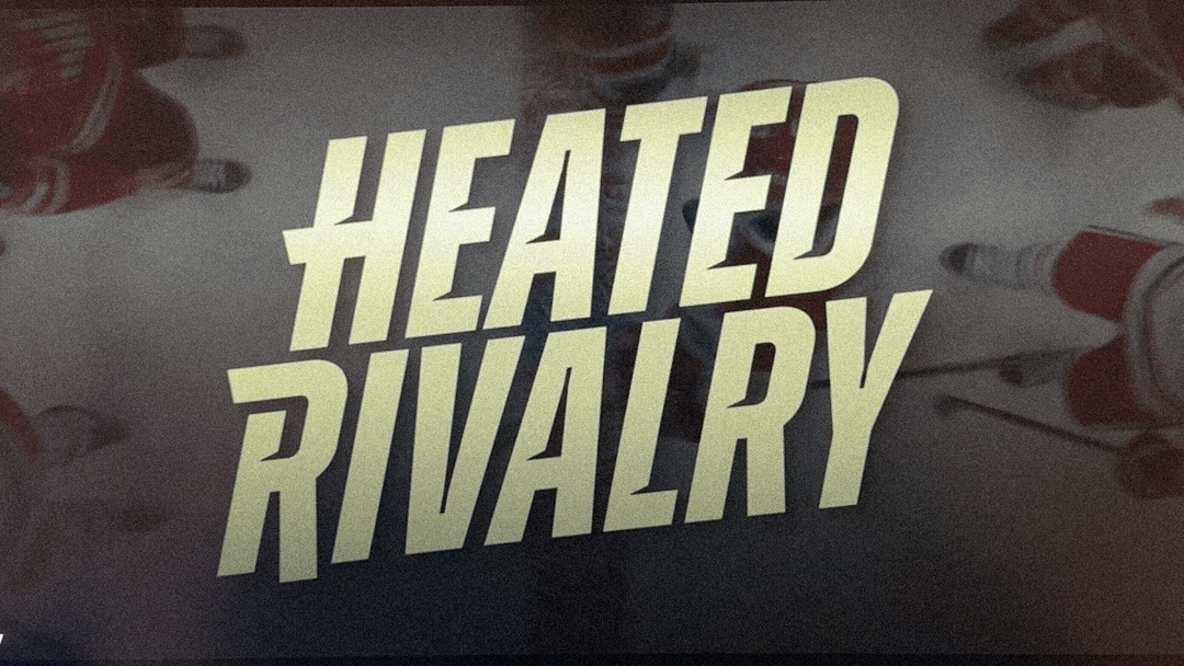
At first glance this is harmless. It’s fancy kinetic type animation. But after finishing the first season, this title sequence feels like a cell phone or data provider advertisement; The large swooping movements of the type feel boisterous, energetic, and bouncy, while the show itself is cinematic, elegant, confident, and sexy.
Even the “Gotta go fast” speed lines trailing off the title feel more about Hockey than about the secret yearning between our two main characters.
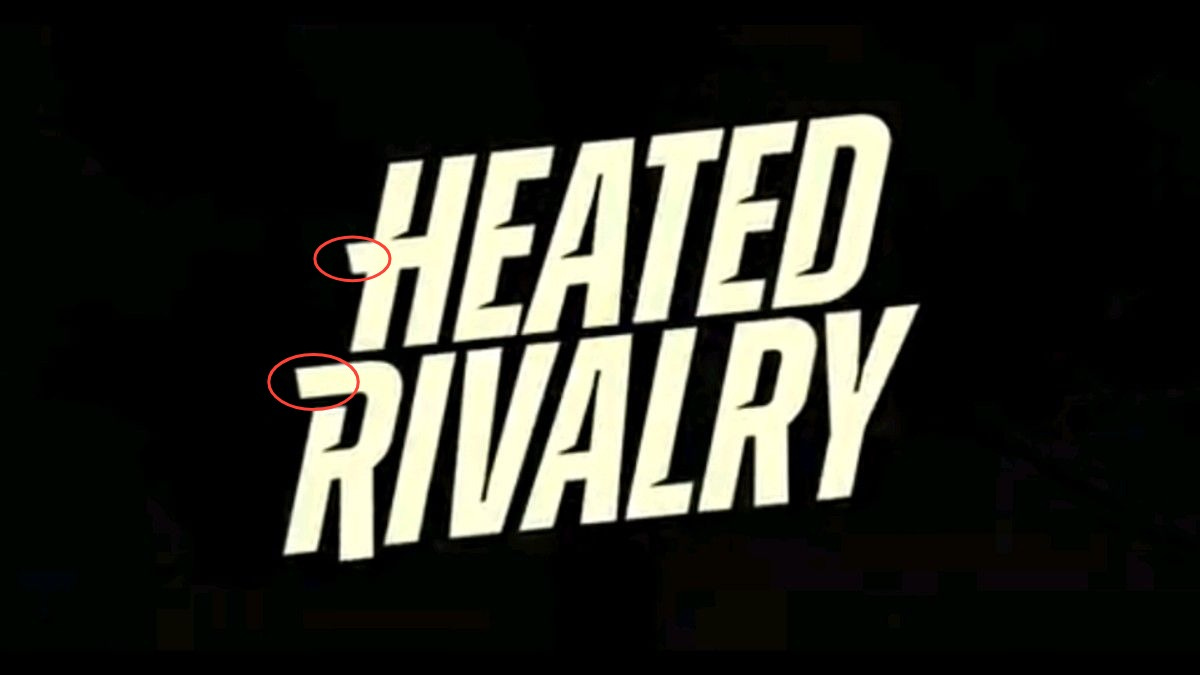
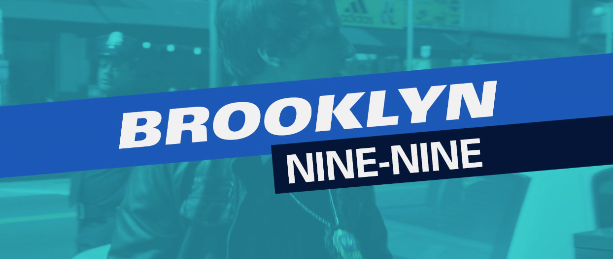
I understand the impulse to give a design nod to hockey, but the show is a romance that takes place in the hockey world, it’s not getting into the play-by-play of a match. In addition, the static letterforms feel heavy and characterful. Similar to the Brooklyn Nine Nine titles, however the type feels more appropriate.
The Time Stamps
The romance between our main characters Ilya and Shane, takes place over a decade starting before their rookie season in the NHL. Roughly 2008-2018. The show keeps you updated on the year, location, and event that the boys are playing at (on opposing teams usually) with three separate large graphic overlays.
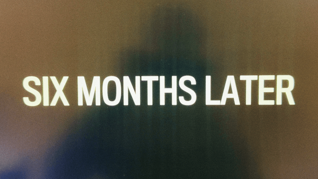
And boy are you told the when, where, and what frequently. I love a graphic that rhythmically cuts between snippets of information, especially when accompanied by intentional sound design. But when you get this same treatment about 5+ times in an episode, it becomes grating. After watching the whole season, these locations and event names aren’t even relevant! In fact, there’s usually an announcer or conversation spelling out what match we’re watching! So the only necessary information for the graphics would be the year and maybe the location. Maybe.
To me, the decision to include this much information in the graphics (and information that could be absorbed through context clues) indicates a lack of confidence in the audience from the Canadian streaming service “Crave” and HBO. The graphics feel like an overly safe answer to “will the audience understand?!?!” Hey Crave and HBO, I’m not sure if you guys have seen the show, but it’s hard not to pay attention.
Improving The Connection Between Show and Graphics
While I deal in motion graphics design and animation rather frequently, I’m not going to pretend like I have all the answers here. However, if I were given the chance to pitch a graphics treatment for Heated Rivalry, here’s what I would try out:
I love the idea of the “Heated Rivalry” typography just appearing on top of shots where Ilya and Shane are together, or watching TV about the other, similarly to how the show executes the time stamps. No animation.
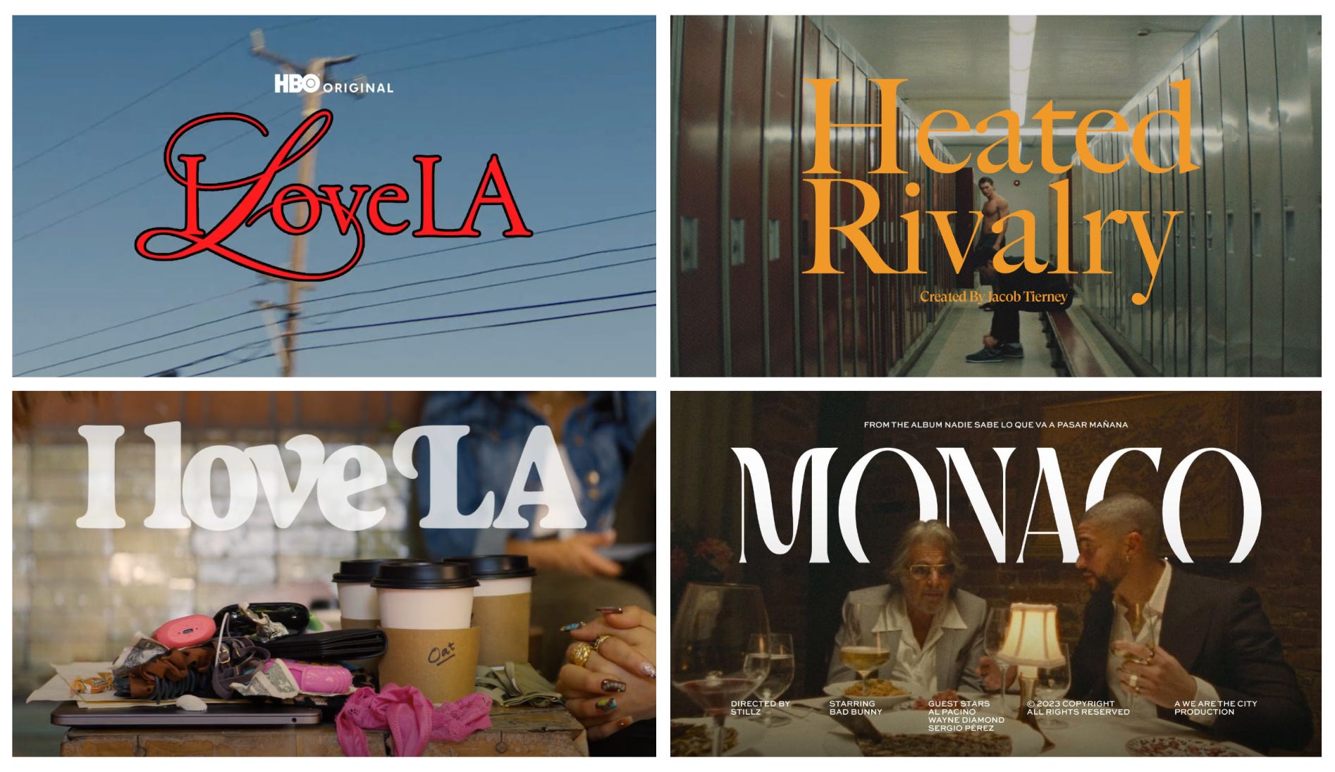
A show that does this well is “I Love LA.” It is set within the less glamorous side of the entertainment business and is steeped in “LA culture.” The titles appear in tiny moments, wide shots, driving shots, and all over the city. These titles steep us within the show’s world, tone, and characters; showing us what it is preoccupied with.
Heated rivalry could do the same thing! The type could appear around Ilya and Shane, being masked in and around their bodies. This could hint at the idea that there’s a subtextual conversation happening between them at all times, a secret relationship building. See my mood board and rough test rough below:
The type could even appear over cinematic Hockey wide shots as they do now, or even while they’re doing that frog stretch on the ice. As long as we’re with our characters in some way.
As far as timestamps, go I think they could appear the same way they do now but we just see the year. The location and event don’t end up mattering and we gather that information very quickly through context. This way we have fewer graphics cutting into our viewing experience and less information to clutter our understanding of the timeline.
Coming To The Cottage
I really loved this show. To paraphrase the legendary drag queen Katya Zamolodchikova on “The Bald and The Beautiful,” podcast, it’s amazing to see a gay romance told without involving frequent displays of hate, violence, or AIDS. It’s just a straight up beautiful love story with amazing performances.
When I enjoy a show like this, it’s frustrating to see the graphics distract and disconnect me from that beauty. The implementation of the graphics, especially the frequent timestamps felt like a studio saying “everyone will be on their phones, so we need to constantly remind them what’s happening.” Ironically, the time/location/event stamps made me more confused about the timeline.
I call this “Mud for the pigs,” or “do you get it” television. The streamer is so scared we will tune out, so they overcompensate to keep us updated.
Decisions made out of this fear undercut the substance of a show, and highlight that this is a business. Our viewing is a sought after resource.
If I’m saying anything in this review, it’s that a show’s graphic design decisions matter. Those decisions are an extension of the story’s essence and shows like “Atlanta,” “Mad Men,” and many others demonstrate how successful motion graphics design can disappear into the show, melding into the overall experience. Seamlessly.
Your Obligatory Cat Photo