


Fuck it, I'm Drawing A Cannoli: Representing Boston For Uniqlo
A breakdown of my recent illustrations for Uniqlo's "UTme!" program.

Who carries the only pair of pants that fit my big butt comfortably? Uniqlo. Who carries sensible basics that I’ve worn for 6+ years? Uniqlo. Who approached me about creating three Boston inspired illustrations for their “UTme!” program? Uniqlo.
The brand’s “UTme!” program is an in-store offering where customers can create high-quality, custom printed tote bags and T-shirts using their own images, or preset designs.

Much like Uniqlo’s EZY fit stretch jeans on my butt, this project felt like a perfect fit. So today, I’m going to walk you through how these illustrations took shape, from sketches to the final physical product.
Concepts & Sketching
My very first idea for this suite of illustrations was “something with bikes.” Not the most intelligent first thought, but it hinted at how I see Boston: I see it from my bike, as a city that’s moving, rolling, and changing. That perspective served as the “north star” for my ideas.
Boston Bikers
For my first concept, I started with four bikers riding together, one in each season. It became clear that the distinctions between seasons would be a bit hard to convey and the client wanted the image to have a quicker read.

To connect this more with the city, they suggested having six bikers spelling out Boston. I grumbled for thirty minutes and then realized that this was a better idea. I then grumbled for a bit longer because I hadn’t come up with it myself.
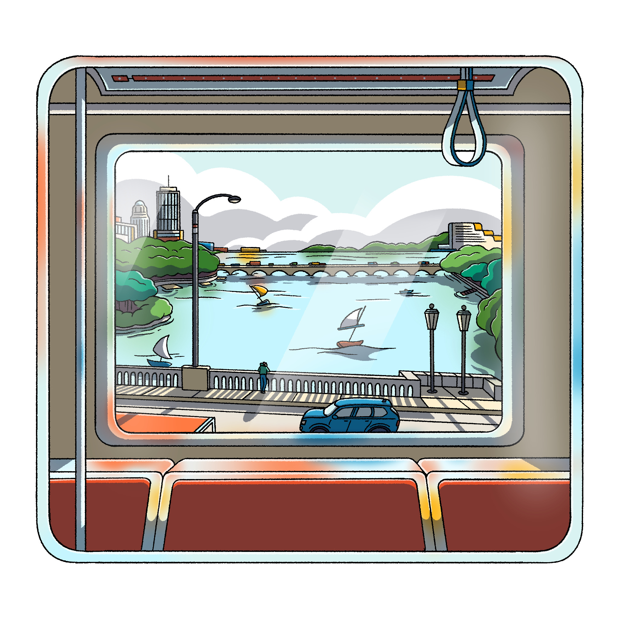
Trains
I grew up using the MBTA (a.k.a the T) buses and trains to get around Boston. Like Pari from love on the spectrum, I think this is a “T-riffic” part of living in the city.
So I wanted one concept to involve the train somehow. I pitched two ideas: one with the green line train going through a tunnel of trees with ghibli-like light stippling, and one looking out of the red-line train window. The latter was a last minute addition that I snuck into the folder after sending the initial submission email.

For the Green line through the trees concept, I was trying to convey the beautiful mixture of modernity and nature that Boston can present, but I think this was too abstract a take for Uniqlo.
We ended up going with the view from the red line between the Kendall/MIT and Charles MGH stations. I grew up with this view and local Bostonians know it well. I’m glad I included this at the last minute, because it because one of my favorites to work on.
Cannoli
I struggled getting the last concept approved. I had pitched a few other ideas that were probably too abstract or obscure. These designs had to scream Boston.
So I said “fuck it, we’re drawing a Cannoli,” and writing Boston next to it. Yes, it’s an easy read and a bit on the nose, but sometimes that’s necessary! One of my agents (shout out to Danielle!) lightly suggested that I emulate another illustration in my portfolio (below) as well, just to give this last piece a human element.
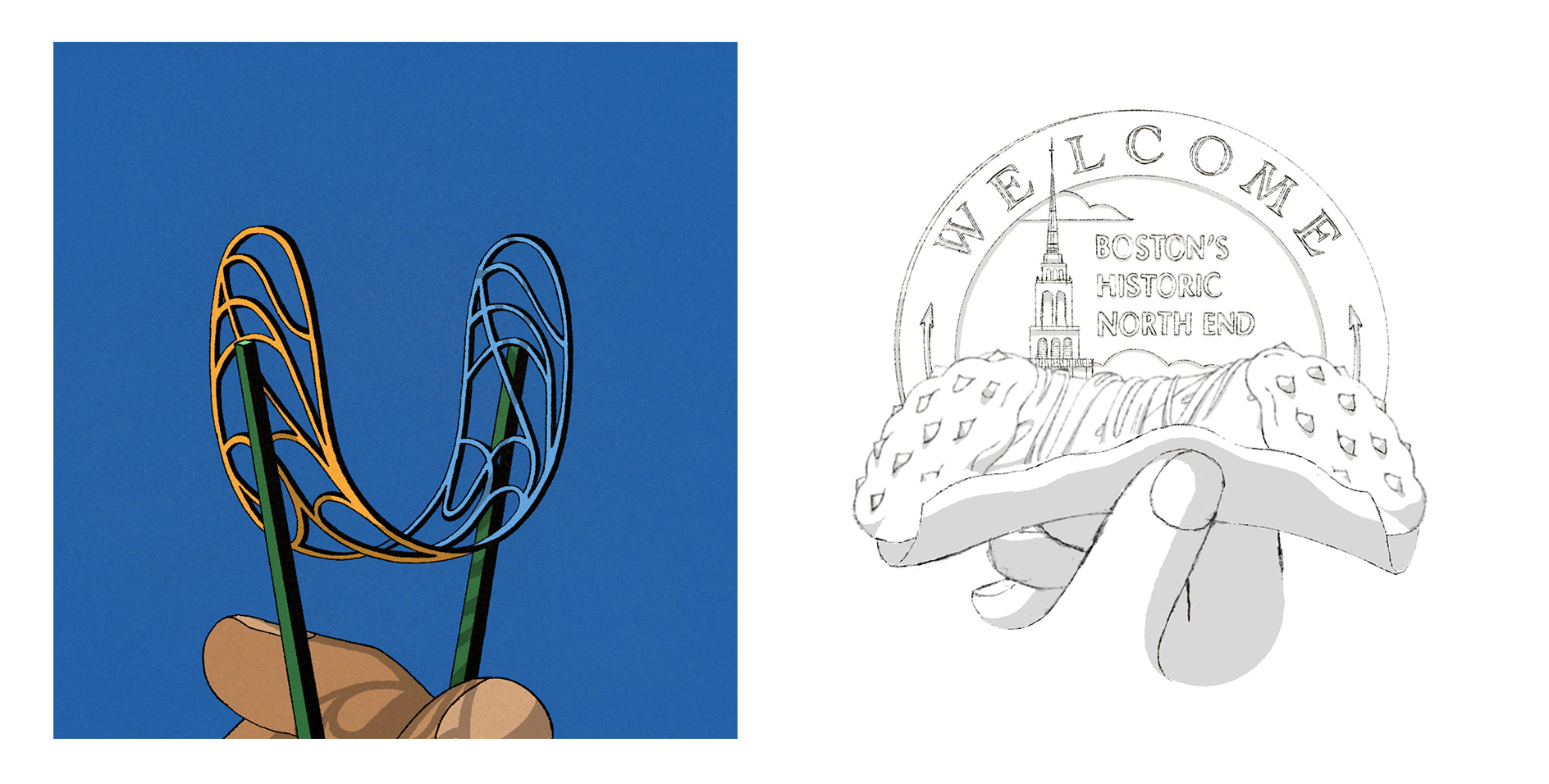
I really valued that suggestion because I was able to differentiate this design from the previous two. Each illustration ended up having a unique composition as a result.
Color & Finishing Touches
For recent projects, I’ve been adding a “color script,” stage when appropriate. This is where I color mini versions of an illustration and experiment with shadow and lighting on a smaller scale. This way I can make my mistakes quickly and form an intentional plan going into the last stages. In this case, I also put color references on the same page, to keep all my thoughts in one place.
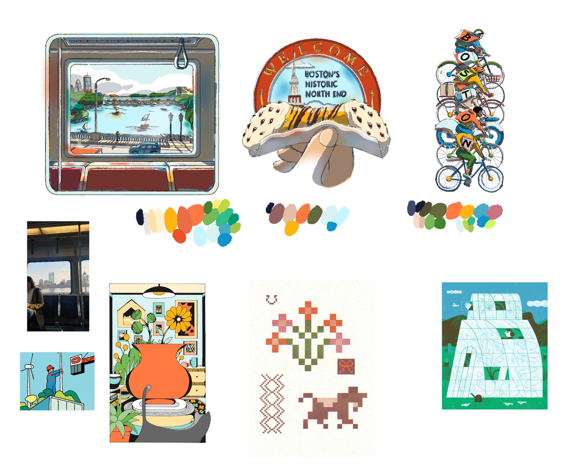
I took the color script plan and fleshed out each design. I added a white highlight layer for the final line work to really push my 2D lighting effects. Lighting was especially important for the train window scene, since it puts more focus on the view from the window itself. To be honest, I wasn’t sure that this level of detail would translate to the printed product, but I was pleasantly surprised.
I used some (digital) airbrushing in the train window and carried that technique into the cannoli design. I used the effect to add dimension to the cannoli napkin and the sky background. White highlights helped me create shine on the chocolate and the finger nails.

My mini color script plan for the bikers was pretty much exactly what I used for the final, barring some lighting additions and character details. I toyed with using more colorful lettering, but black type worked best and made this design a quicker read for the viewer.

The Final Products
After a couple weeks, Uniqlo did a soft launch of these designs in their Boston, Newbury Street location. I was incredibly impressed with the quality of the printing. The designs felt right, and true to the way I see Boston.


I would be remiss if I didn’t credit part of the success of this project to my wife Emily. She gave me feedback and ideas throughout the process and helped me take beautiful photos of the products. I wouldn’t have found jeans that fit my butt without her help and I wouldn’t have been happy with these designs without her mind.
Thanks for reading and here’s your obligatory cat photo:
This is another good read. Would be nice to see the display in the store too!